
Trackii: Designing a privacy-first finance app for multi income earners
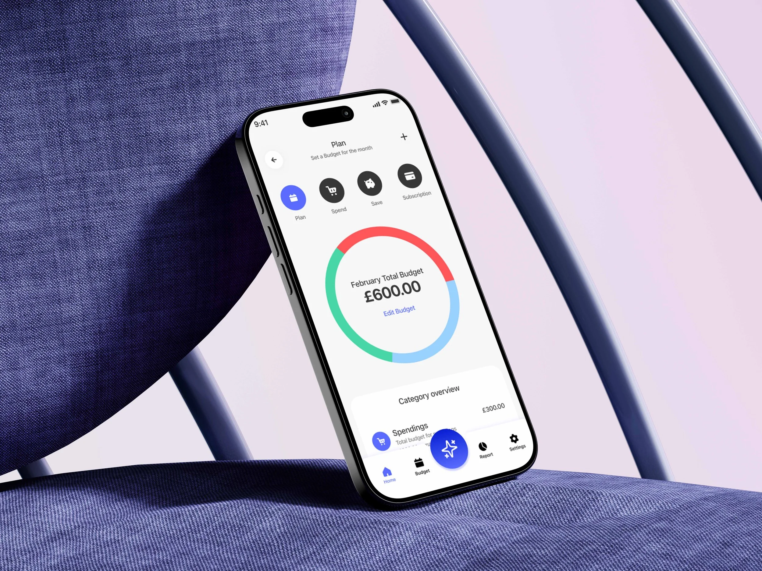
Trackii is a privacy-first personal finance app built for multi-income earners who need clarity over their money without surrendering it to a bank.
Trackii is a deliberate stand against open banking: no sync, no data sharing, no assumptions about how you get paid.
Most budgeting apps assume a single paycheck and force a bank connection.
Trackii splits income by source, works entirely on manual entry (no bank linking), and layers AI on top, a receipt scanner and a financial advisor to remove the tedium that kills budgeting habits.
Role
Product strategist, UI/UX Designer, AI Engineer
Year
2026
Duration
5 Months
Tools
Figma, Flutter, Claude code
Overview and problem statement
Most personal finance apps assume a salary. They're built around bank syncing, fixed monthly income, and subscription tiers that reward people who already have their finances sorted.
For gig workers, contractors, and self-employed creatives, people with irregular income, multiple income streams, and a strong need for privacy, it was different.
Research / Audit
What existing finance apps get wrong for this audience.
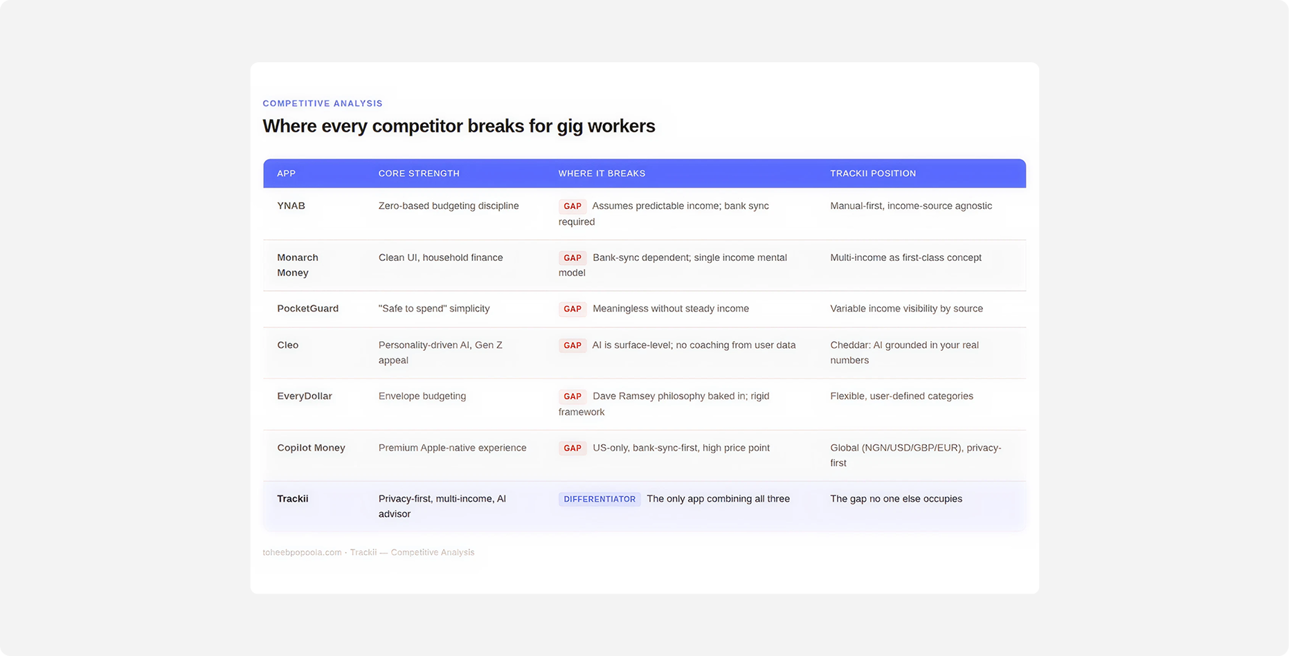
I audited the competitive landscape: YNAB, Monarch Money, PocketGuard, Cleo, EveryDollar, Copilot Money.
Mapping where each one fell short for the gig economy user.
The pattern was consistent: open banking as a default, salary-first UX assumptions, and onboarding flows that alienate anyone whose income doesn't arrive on the same date every month.
That gap became Trackii's position: manual-entry, privacy-first, and built around income that moves.
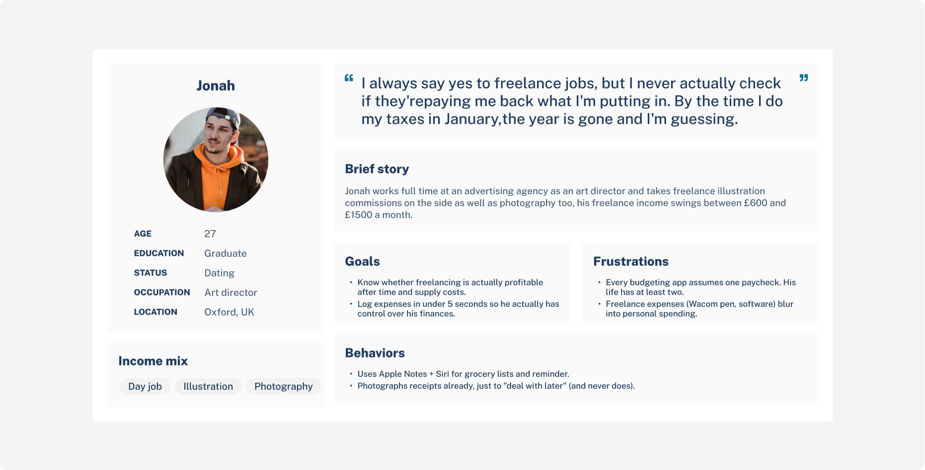
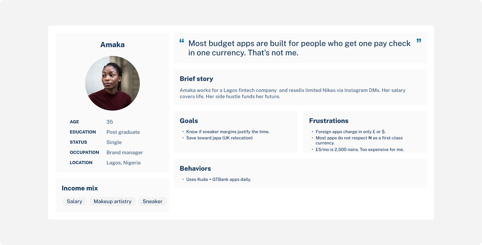
User personas
Core Insight
Through user conversations with people in my target audience (young adults, multi-income earners, mostly in the UK and Africa), one pattern surfaced repeatedly:
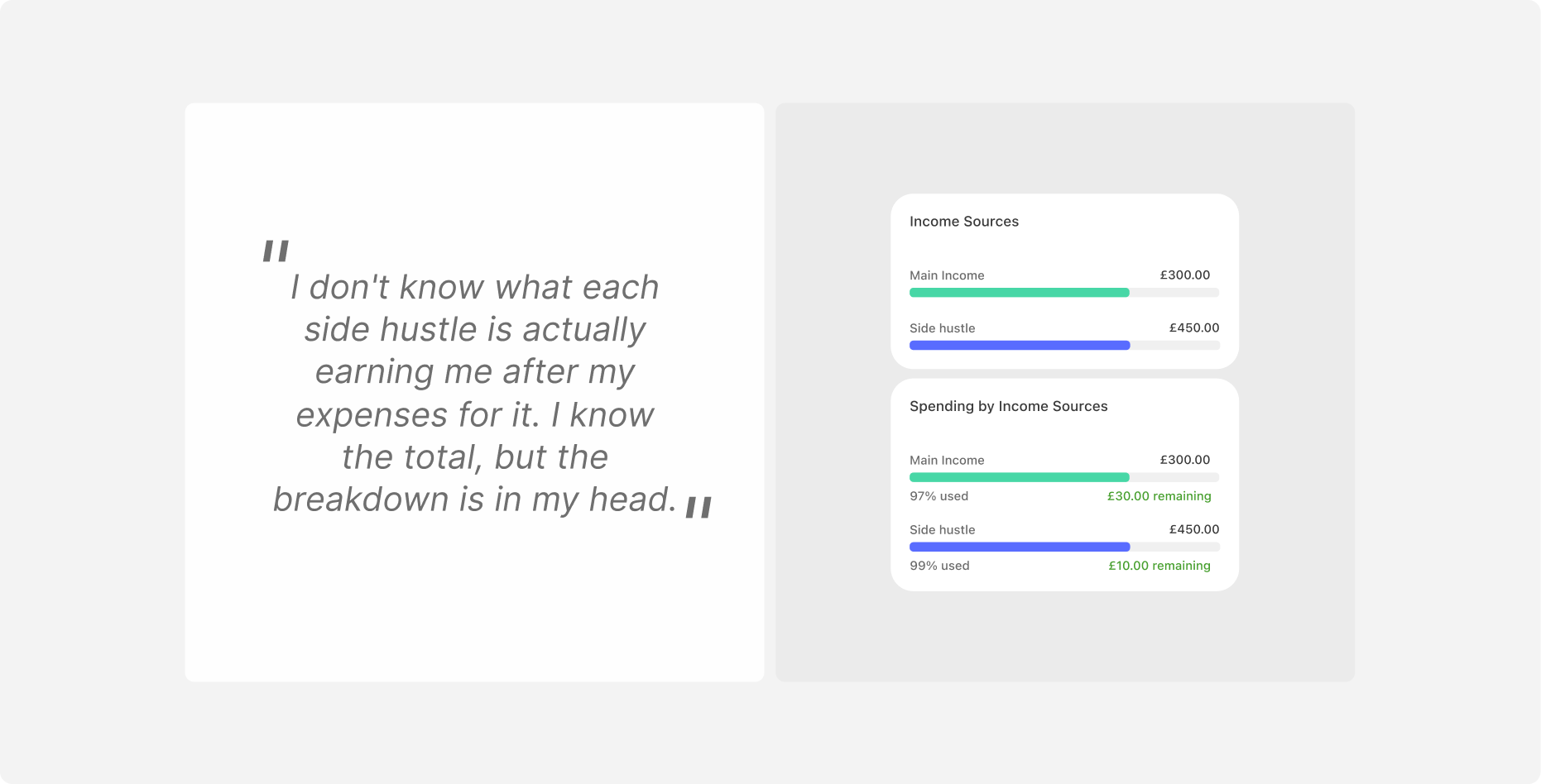
"I don't know what each side hustle is actually earning me after my expenses for it. I know the total, but the breakdown is in my head."
The mental model wasn't "my budget." It was "my budgets," plural, sometimes loosely connected, sometimes deeply intertwined.
A camera lens bought for a photography hustle isn't a personal expense, but isn't a tax-deductible business expense either if you're not registered. It lives in a grey zone every existing app ignores.
That insight reshaped the entire data model. Every spending entry, savings entry, and subscription in Trackii has a hustle ID, it's attached to a specific income stream, or to "main income" by default. The reports screen breaks this down visually with one bar per hustle. Users finally see what each stream actually nets.
The brief was direct:
Build something that respects how freelancers and 9-5ers with side hustles actually earn.
Make sure it does not require them to hand over their banking credentials to use it.
Make the onboarding simple and short
Key design decision - The first one was wrong
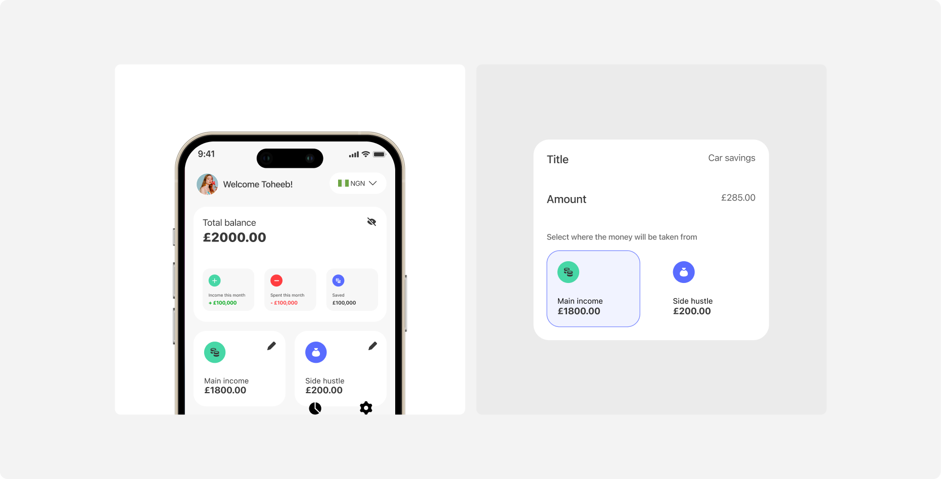
Trackii v1 launched with what felt like the right primitive: every user had two buckets, Main Income and Side Hustle.
A salary on one side, "your hustle" on the other. Simple. Easy to onboard. It modelled the conversations I'd been having in early research, where most people described their finances as "my job and my thing on the side."
That binary collapsed within two weeks of testing.
What the testers actually told me
Of the first 12 people I sat with after the initial release:
Seven had two or more active side hustles running at once
Three had a full-time job plus freelance plus a separate passive income stream
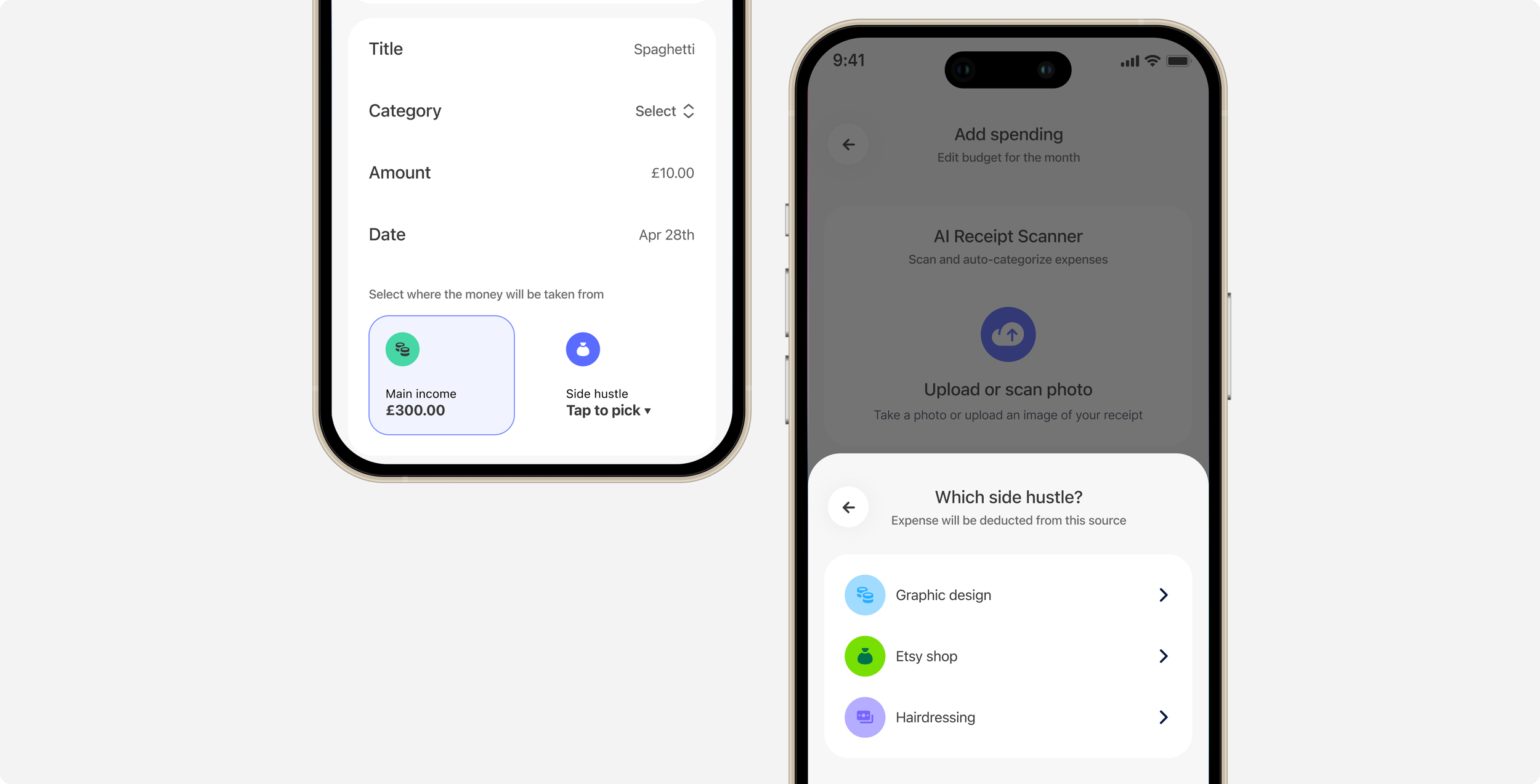
Two said, almost word-for-word: "Which hustle do I put my Hairdressing income in? It's not 'the' side hustle, it's one of three."
One tester, a freelance illustrator in Manchester, opened the app, looked at the "Side Hustle" field, and asked me: "So which one of my four am I supposed to track here?" She closed the app, didn't open it again that week, and uninstalled it the following Sunday. That was the moment I knew the foundation had to change.
The Realization
The mental model wasn't "my budget." It was "my budgets," plural. A photography hustle and a tutoring hustle are not the same thing reshuffled, they have different clients, different costs, different rhythms, different unit economics. Lumping them together is the same mistake as lumping rent and groceries under "expenses." Useful at the top level. Useless if you actually want to make a decision.
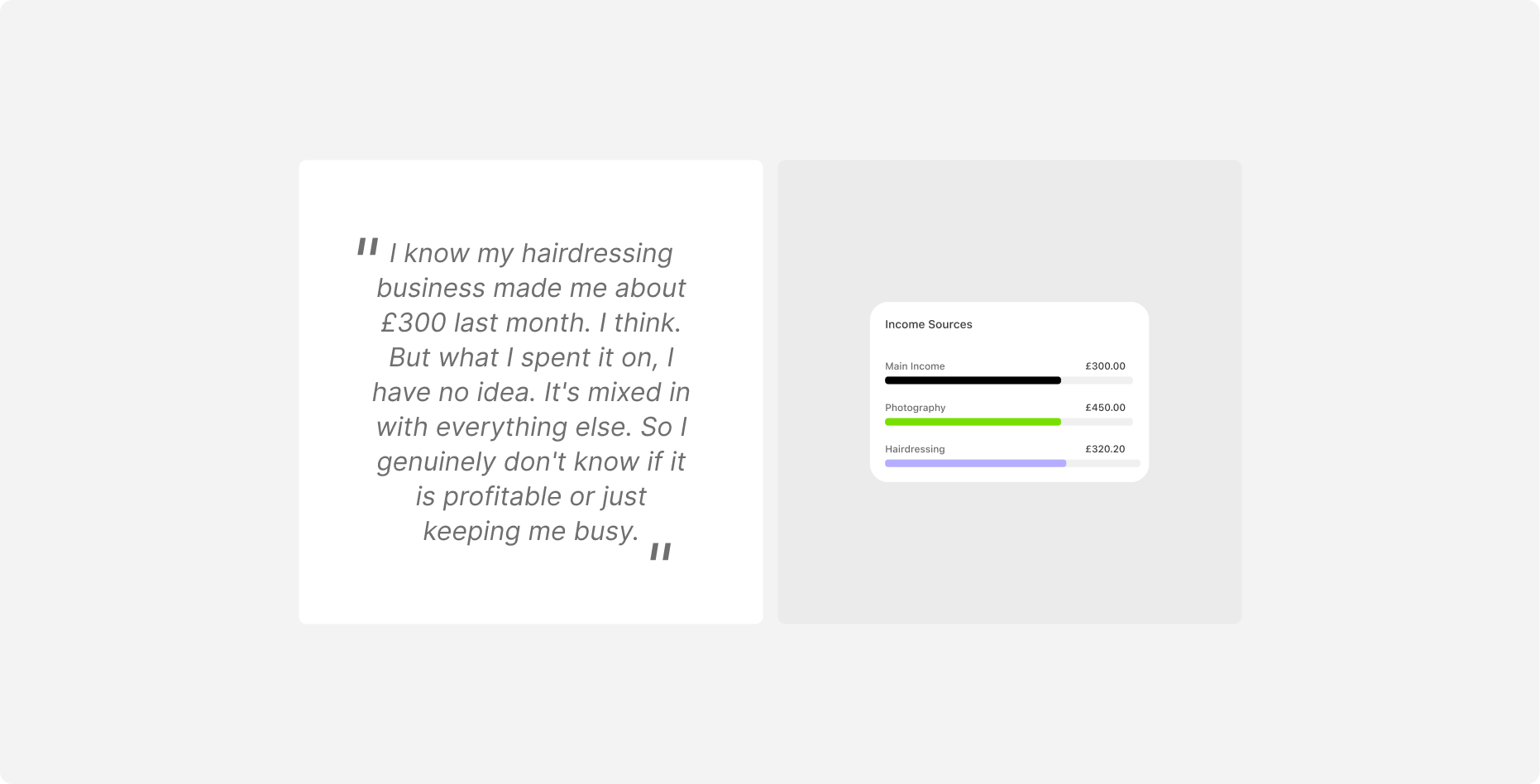
"I know my hairdressing business made me about £300 last month. I think. But what I spent it on, I have no idea. It's mixed in with everything else. So I genuinely don't know if it is profitable or just keeping me busy." - Tester 4
That quote reframed the problem. It wasn't "how do I track my side income?" It was "how do I know which of my hustles is paying me what? and what do i spend it on?"
Back to the drawing board
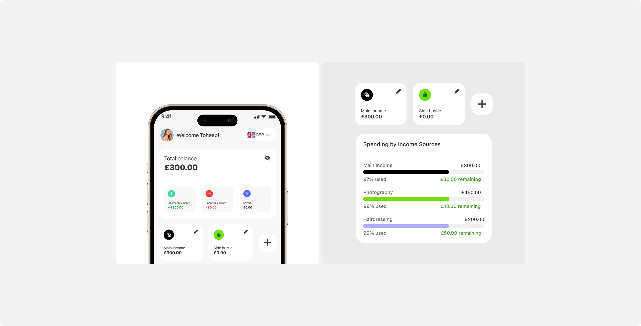
I rebuilt the data model. Side Hustle stopped being a hard-coded bucket and became a first-class object users could create, name, colour, and delete at will. Photography, Tutoring, The hair-braiding business, Each one is its own entity, with its own income figure and its own thread running through every spending entry, savings entry, and subscription in the app.
Three structural decisions made this work:
Every entry carries a Hustle ID. Spending, savings, and subscriptions are all tagged at the moment of creation, defaulting to "main income" if the user doesn't explicitly assign.
The home screen became a scrollable income carousel. Instead of one number labelled "Side Hustle", users now swipe through one card per hustle. The interaction itself reinforces the mental model: each hustle is a thing, not an undifferentiated lump.
Reports finally became useful. The Reports screen renders one bar per hustle. Users see what each stream actually nets, not a smushed-together total.
The “Delete this hustle” dilemma
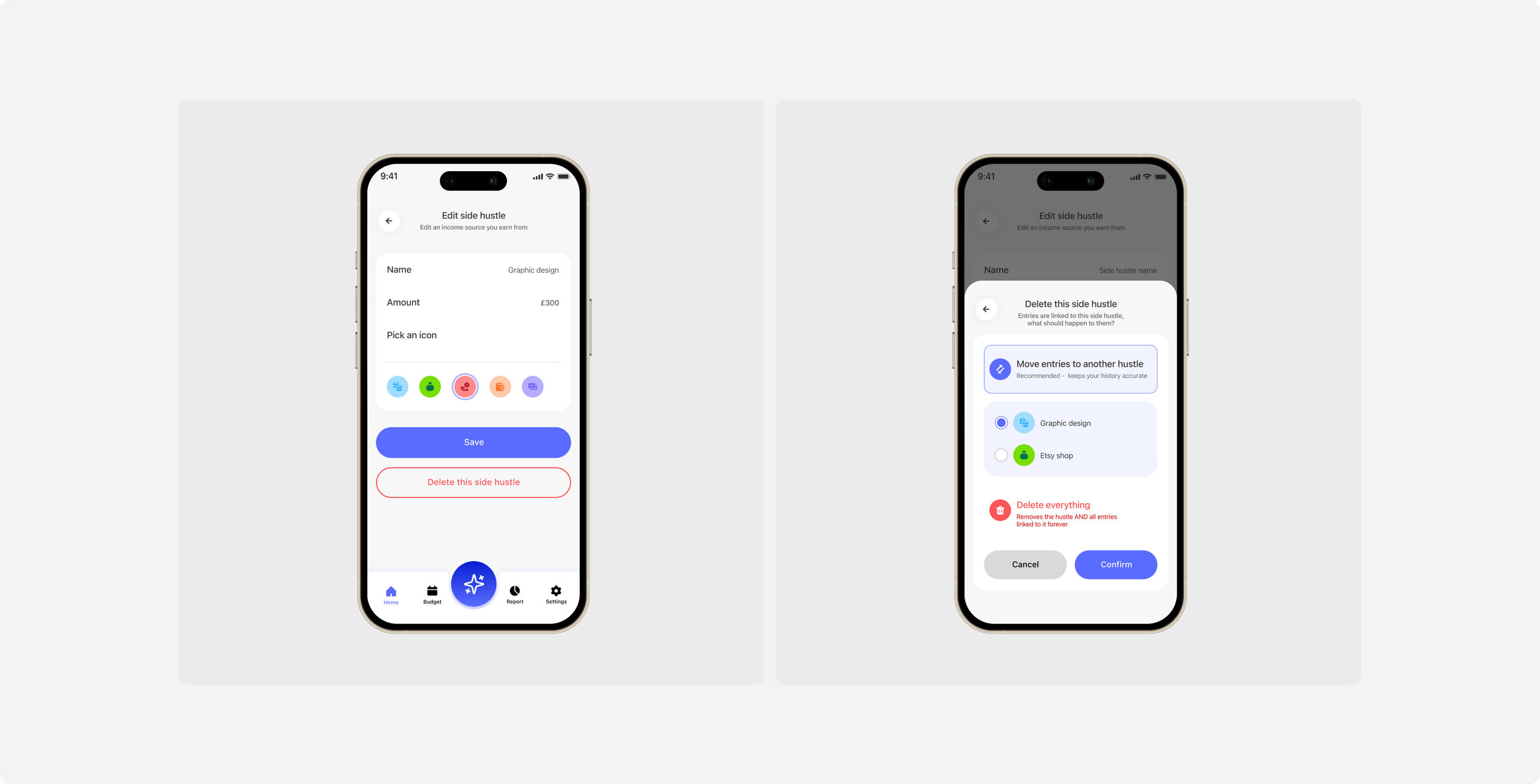
When a user deletes a side hustle, months of linked expenses become orphans.
Three options I considered:
Cascade delete everything = clean, but destroys real data
Hide the deleted hustle but keep entries = leaks "ghost" categories
Force user to reassign entries before delete = feels like punishment
I settled on a bottom sheet with two radio options: Move entries to another hustle (default, with an inline destination picker when there are 2+ alternatives) or Delete everything.
The default is the safer choice. The destructive option is one tap away but requires intention.
When there's only one possible destination, it auto-selects so the user doesn't have to think.
This pattern took three rounds of iteration. The first version asked the user before showing the sheet, which felt redundant. The second made "Delete everything" too prominent. The final version had the safe choice surface first, dangerous choice acknowledged but de-emphasised.
AI Advisor with visible limits
I shipped an AI financial advisor powered by Anthropic Claude, with a hard cap of 100 chat messages per month on the standard tier (50 on the Nigerian tier, more on that below). Most apps hide their AI rate limits and only surface them on failure. I made the limit visible in Settings, with a live counter: "AI usage this month: 17 of 100."
Why? Transparency builds trust with AI features. Surfacing the limit upfront prevents the disappointment of a feature silently failing mid-conversation. Three of my testers said the visible counter actually made them use the advisor more, they treated the budget like a resource and asked higher-quality questions.
Region-aware pricing and tiers
The standard subscription is £5.99/month. In Nigeria, where I'm from and where the median monthly disposable income is dramatically lower, that price excludes the people who need budgeting the most. the Nigerian tier was priced at ₦1,000/month (roughly £0.50).
But the AI features cost real money to run on Anthropic's API. At ₦1,000, Claude Sonnet would burn through the margin in three conversations. So Nigerian users route to Claude Haiku, which is cheaper, faster, and still excellent for the financial advice use case.
Rate limits also reduced: 50 chats, 30 receipt scans, 4 monthly insights vs. 100/60/8 on the standard tier.
This is a UX decision dressed as engineering. The user experience question was "how do I make this accessible without breaking the unit economics?" The answer involved both a pricing decision and a model routing decision, designed together. The user never sees this complexity. They just see an app they can afford with an AI that responds quickly.
Siri voice intents for the highest friction action
The single biggest friction in any budgeting app is the act of logging. Open app, find tab, tap "+", pick category, type amount, save.
Five steps that compound into "I'll log it later"... and then you don't.
I built six Apple Siri intents that collapse this to one voice command:
"Hey Siri, log £4.50 lunch in Trackii"
"Hey Siri, log £20 to savings in Trackii"
"Hey Siri, add a £9.99 Netflix subscription in Trackii"
"Hey Siri, update my Etsy income to £350 in Trackii"
But Siri intents have a silent failure mode: they require Apple's Shortcuts app, which most users don't realise exists. So I built a one-time install-prompt dialog that detects whether Shortcuts is installed and, if not, nudges the user to install it from the App Store. The detection runs once per device, never nags, and adds about 50ms to first launch. It closed a usability gap that 8 out of 12 testers had hit in earlier builds without realising the cause.
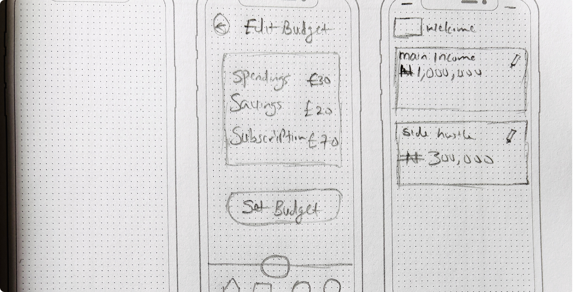
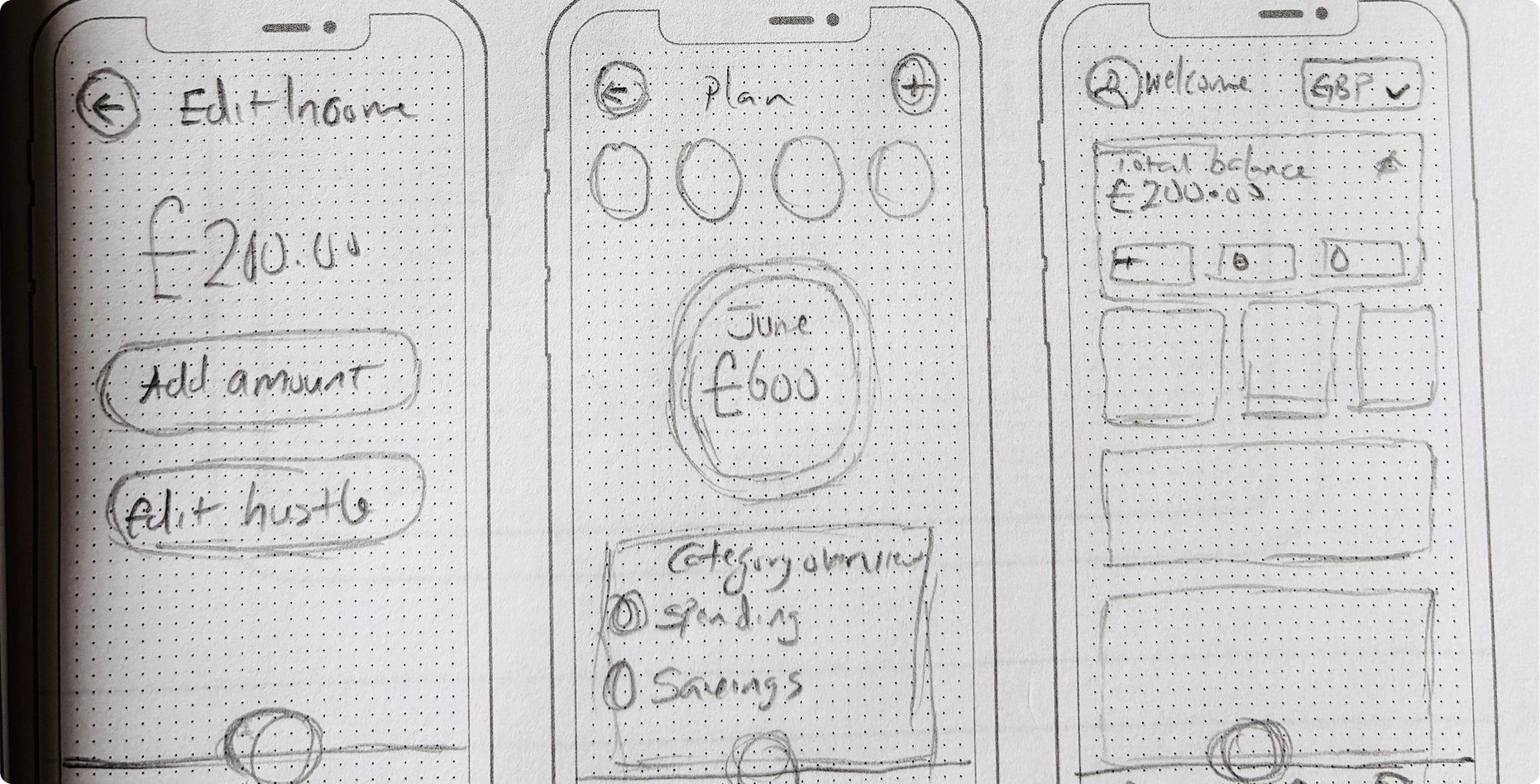
Sketches
High fidelity
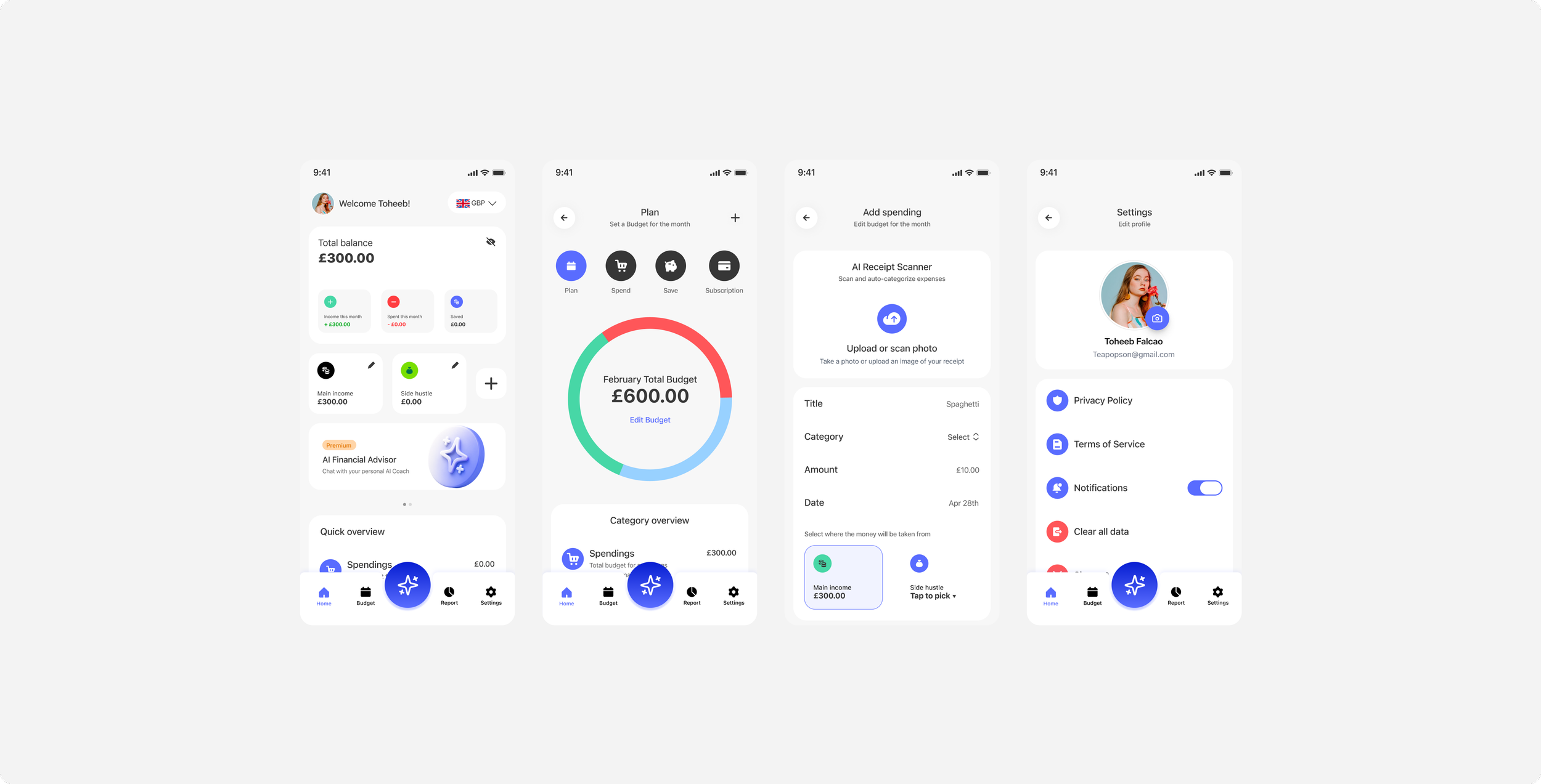
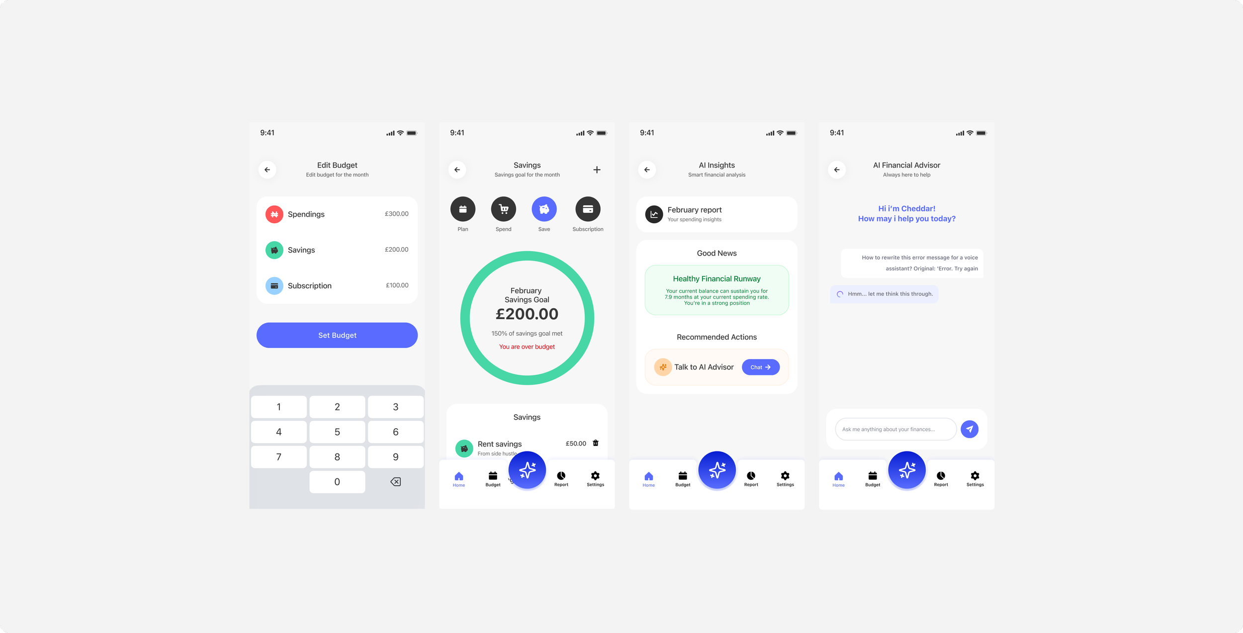
What i learned…
Three things became clear over six months of shipping:
Multi-income is a foundational primitive, not a feature. When I treated it as a "side hustles" tab, the product felt disjointed. When I treated it as the core data model, every other feature got easier to design.
Inclusive pricing is a design problem before it's a business problem. Charging £0.50 vs £5.99 changes which AI models are economically viable, which changes response latency, which changes the chat experience. Pricing tier and product tier had to be designed together.
Voice and quick-action interfaces matter more for budgeting than for almost any other category. The activation energy of "open app + navigate + type" is what kills logging habits. Siri intents and lock-screen widgets aren't add-ons, they're the actual product for power users.