Onut Tech: Creating a brand identity for a safety-tech platform empowering riders
Onut is a safety-tech platform that empowers passengers to verify drivers, report unsafe rides, and protect their communities.
By combining community-driven reporting with AI-powered verification, Onut builds a trusted safety network that prevents riders from falling victim to dangerous drivers and provides valuable mobility insights for cities and organizations.
Role
Brand designer
Year
2025
Duration
4 weeks
Tools
Figma / Leonardo AI / Adobe Illustrator
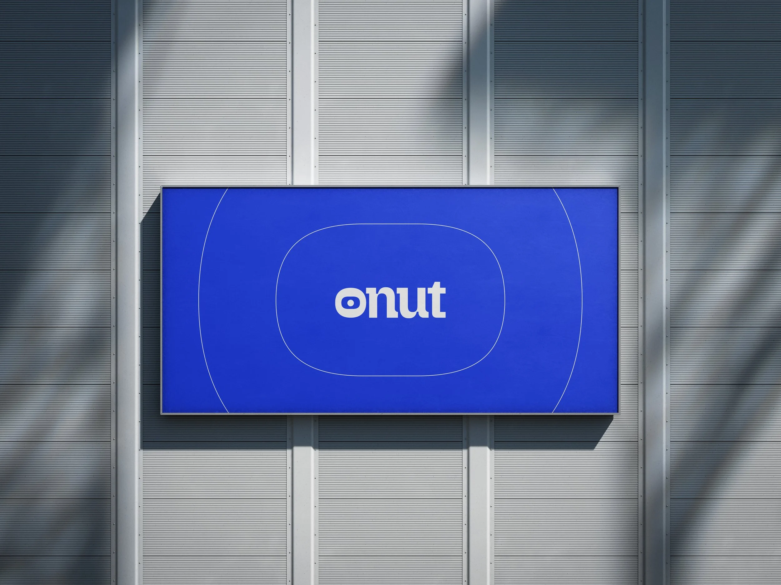
One of the biggest challenge faced while designing Onut’s identity was balancing trust, community and security. I wanted something unique that communicates credibility, calm, secure and confidence.
That’s why the color blue was chosen. A color universally linked with trust, reliability, and technology.
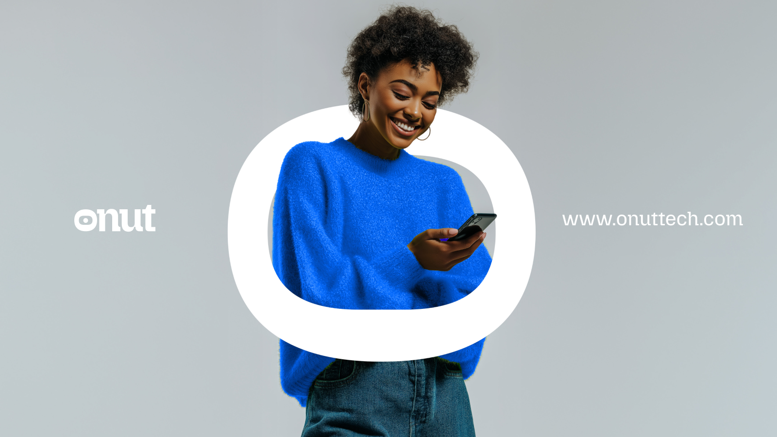
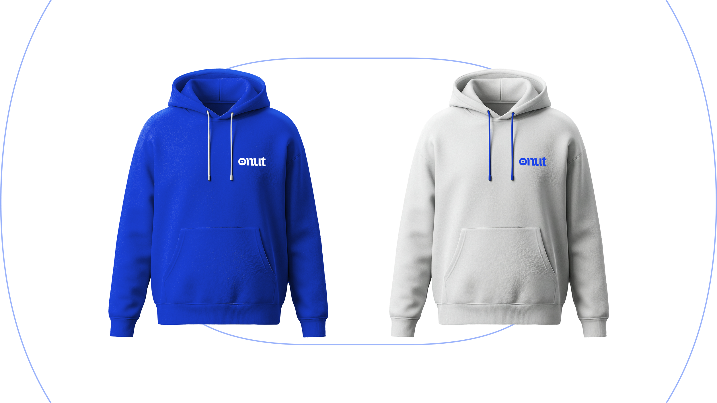
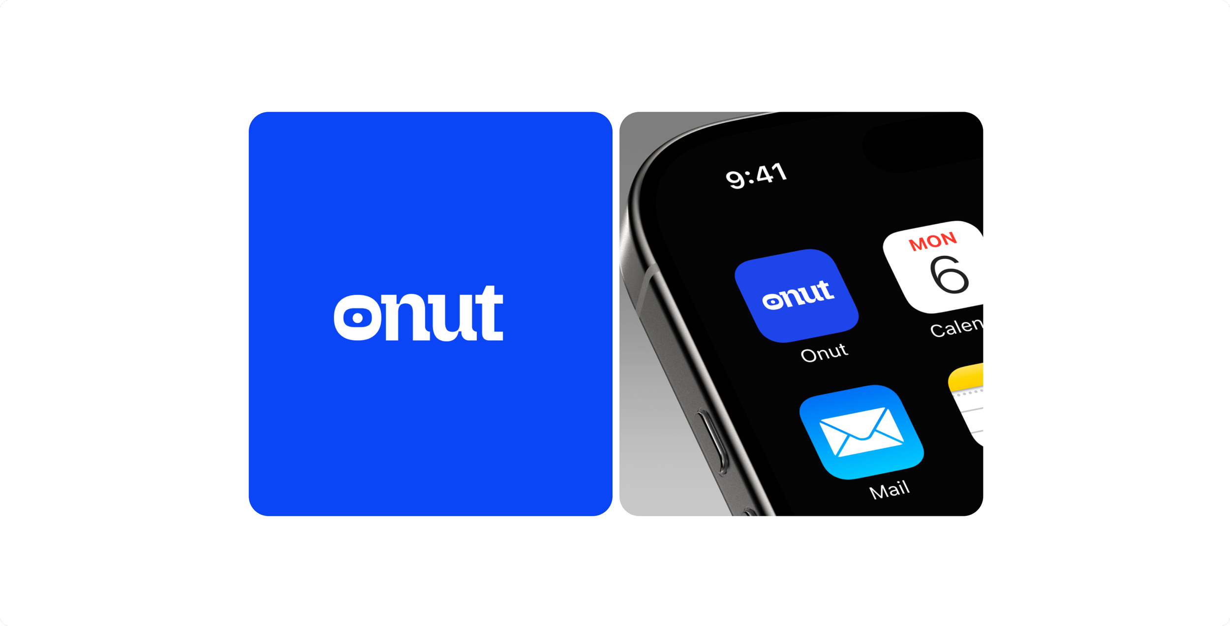
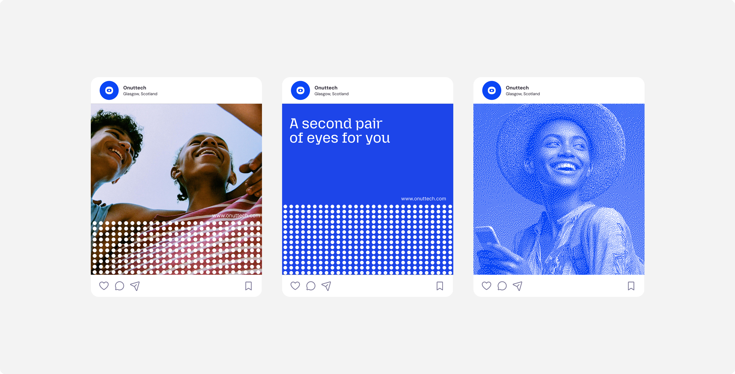
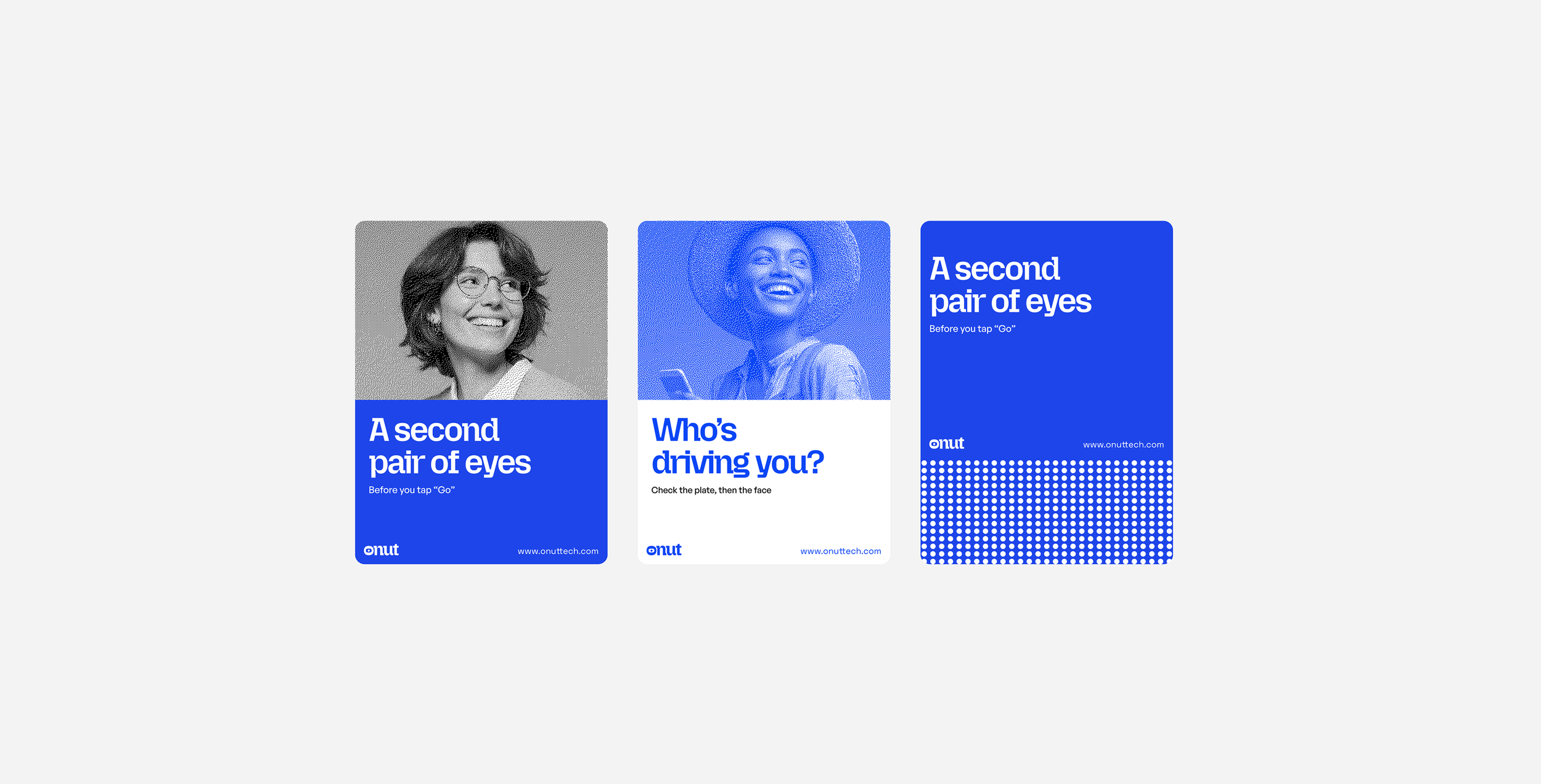
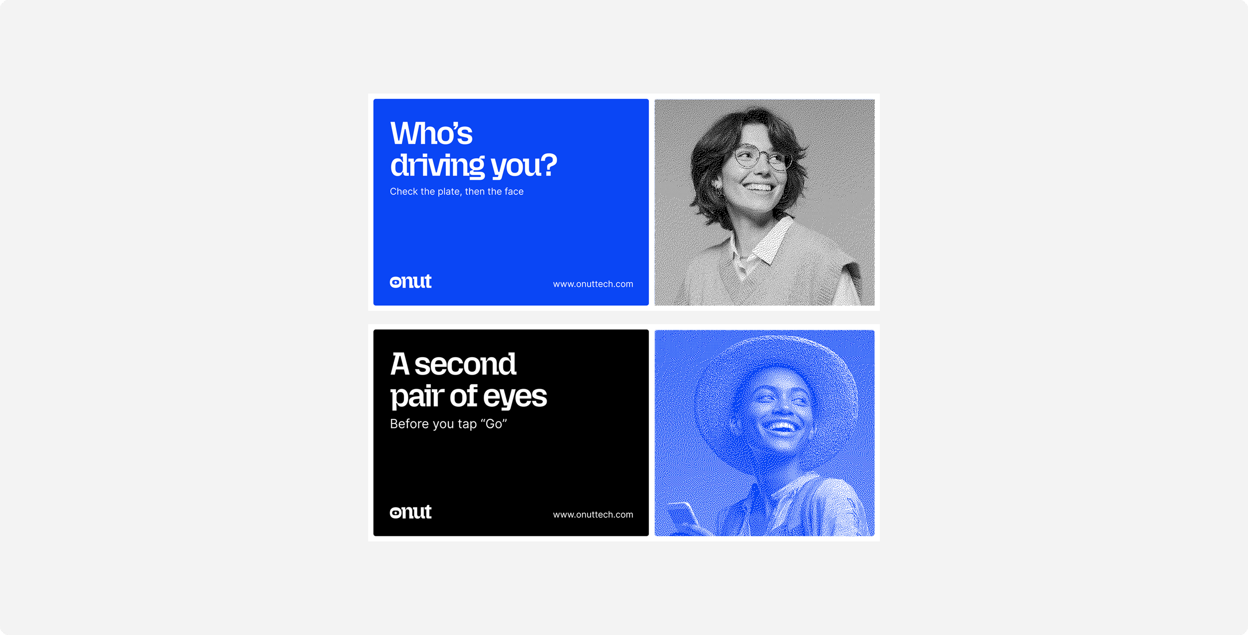
By pairing it with bold typography and clear iconography, I created an identity that feels both professional and approachable, reminding riders that Onut is not just an app, but a dependable safety companion.
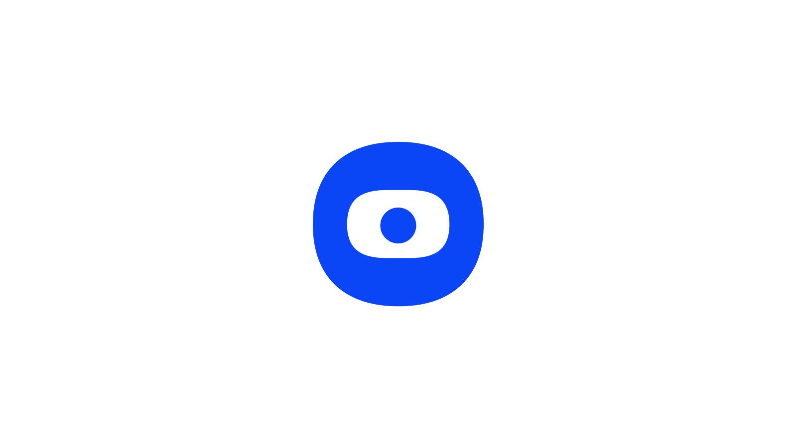
The “O” in onut became the eye that watches over the community.